Why hostel interior psychology matters more than the thread count
In a premium hostel, the way you feel walking into the lobby matters more than the logo on the key card. Thoughtful hostel interior design color light psychology uses every color and every beam of light to tune your mood before you even see your room. For couples choosing between several rooms online, this evidence based design approach can be the difference between a quick overnight and a stay that becomes part of your shared story.
Design led hostels borrow from hospitality architecture and university campus research, using colour psychology and color psychology to shape how guests interact in shared space. When you see warm colors like soft red, muted orange, and gentle yellow in the living room or bar, you are more likely to talk, linger, and feel socially open. Cool colors such as blue, blue green, and green violet in dorm rooms and quiet lounges lower visual noise, slow your heart rate, and help your body shift toward rest.
On a luxury focused booking website, photos rarely explain why one interior feels instantly calm while another feels chaotic. The answer usually lies in the color palette, the balance between warm and cool colors, and how the building color works with natural light across the day. A well planned hostel uses coherent color schemes from entrance to rooms, so the psychology interior story stays consistent rather than jarring. When you scan images, look for a specific color logic instead of random colors splashed across every wall.
Color choices, shared moods, and the architecture of connection
In high end hostels, architecture and interior design now work together to choreograph social energy. Projects like Bayreuth Youth Hostel by LAVA Architects show how a Y shaped layout and central space can guide guests toward connection without feeling forced. When you browse a premium listing, pay attention to how rooms open into shared space and how color and light support that flow.
In communal rooms, warm colors such as red orange, orange yellow, and red yellow are often used in accents rather than full walls, because intense red can raise heart rate and quickly exhaust you. A balanced color wheel approach might pair a deep blue sofa with orange cushions, or a white wall with a single green or yellow stripe that leads your eye toward the bar or kitchen. This kind of building color strategy uses color preferences research without turning the interior into a theme park.
Couples who value quiet intimacy should look for hostels where the living room and bar use warm tones only in specific color zones, leaving calmer blue green or green violet corners for reading and private conversation. Photos that show every surface painted in loud colors suggest a design that serves the camera more than the guest. For a deeper look at how adaptive architecture shapes hostel character, explore guides to converted buildings giving hostels their best addresses, then compare how those spaces handle colour and light.
Light, rooms, and the quiet power of where your eye lands
Natural light is the most underrated luxury in any hostel room, especially when you are sharing with strangers. A window that frames a calm slice of city or courtyard can make a compact space feel generous, while a badly placed opening can flood top bunks with harsh white glare at sunrise. When you evaluate photos on a booking website, check where the windows sit relative to the beds and how the interior design handles both day and night lighting.
Thoughtful hostels layer ambient, task, and accent lighting so that one guest can read while another sleeps without conflict. Ambient light should wash the rooms in a soft, even glow, often using warm colors in the evening to cue relaxation, while cool colors in daytime common areas keep you alert. Task lights at each bunk, ideally with a small pool of blue or neutral white light, let you control your own mood and activity without lighting the entire space.
Accent lighting then shapes how you feel about the architecture and the shared space, highlighting a staircase, a piece of art, or a living room corner where conversations naturally start. Some of the best hostels use evidence based psychology interior principles, placing brighter warm light near entrances and dimmer cool light deeper in the rooms to guide movement. For a sense of how these layers play out in real properties, look at how the rooftop, the kitchen, and the courtyard are treated in design focused reviews of three spaces that define a hostel.
Top bunk, bottom bunk, and the psychology of your personal space
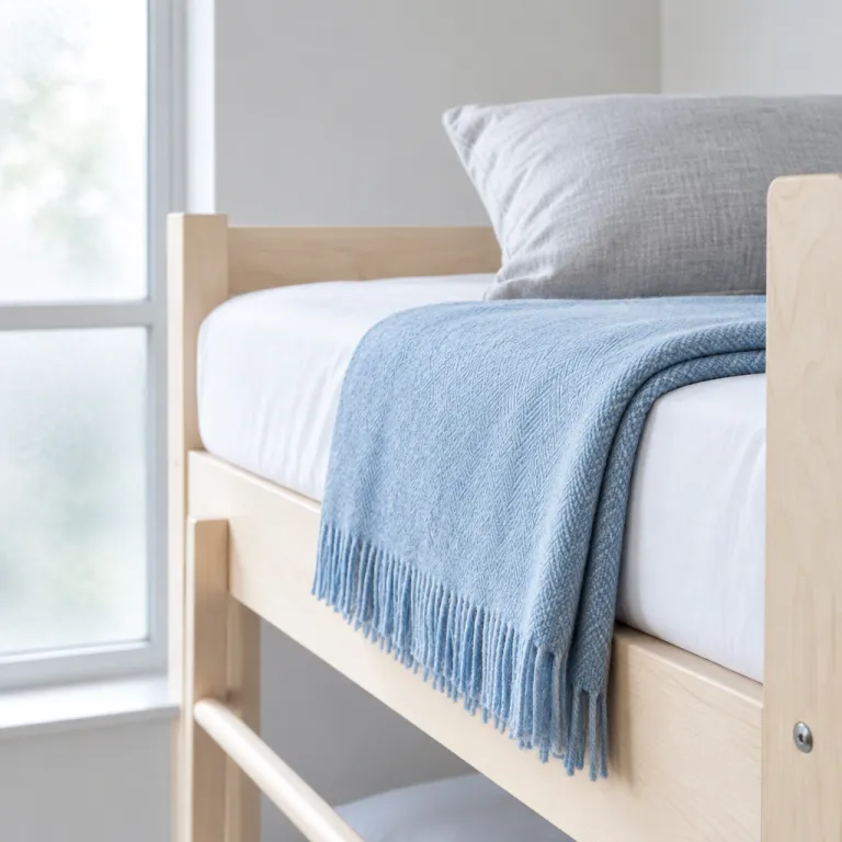
The choice between top bunk and bottom bunk is more than a practical decision about climbing a ladder. Hostel interior design color light psychology shows that where your eye lands from the mattress edge changes how safe and relaxed you feel. On the top bunk, you see more of the room and more of the colors, which can feel liberating or overstimulating depending on the design.
Well considered interiors use a calm color palette around the upper level, often with cool colors such as blue or blue green on the walls and curtains, so the extra visual field does not overwhelm you. Bottom bunks, by contrast, benefit from slightly warmer tones like muted orange or soft yellow on nearby panels, which make the smaller space feel cocooned rather than cramped. In both cases, a white ceiling and restrained building color above eye level prevent the rooms from feeling too low or too busy.
Look for hostels where each bunk has its own small light, shelf, and curtain, because these design details let you control your own mood and sense of privacy. When the curtain fabric uses subtle colour psychology, such as green violet or gentle red orange patterns, it can soften the transition between your personal space and the shared room. For couples booking mixed dorms in design forward properties, it is worth checking photos closely or reading reviews that mention how the bunks feel in real use, not just how they look on social media.
Reading premium hostel photos like a design insider
When you scroll through a luxury hostel listing, treat the gallery like a mini design audit rather than a mood board. Start with the living room and bar, because these rooms reveal how seriously the property takes psychology interior principles. Warm colors in cushions, art, and small furniture pieces can create a sociable feel, but if every surface screams with colors, the effect in person may be exhausting.
Next, examine the dorms and private rooms for coherence between color schemes and light. A calm interior might pair white walls with a specific color accent, such as blue headboards or green lockers, repeated consistently across rooms. If you notice random red yellow stripes in one room, orange yellow tiles in another, and a clashing color wheel of patterns in the corridors, the design may be chasing Instagram rather than long term comfort.
Finally, consider how the hostel uses cool colors and warm colors across the entire interior design, from entrance to rooftop. Cool tones like blue and blue green work best where you sleep or work, while warm tones like red orange and yellow belong where you gather and celebrate. For couples curious about how different cultures handle compact rooms and light, a guide to what Western travelers get wrong about capsule culture offers useful context before you book a design driven property abroad.
How to align color psychology with your own travel style
Every traveler brings personal color preferences and habits into a shared hostel space. If you and your partner recharge in quiet, choose interiors where blue, green, and other cool colors dominate the rooms, with only small warm accents in the living room or bar. If you thrive on late night conversation, a hostel with stronger warm colors in communal rooms and softer white or blue tones in the dorms will match your natural rhythm.
When you read descriptions on a premium booking website, look for evidence based language about interior design rather than vague claims about vibe. Phrases that reference colour psychology, color psychology, or research into heart rate and mood suggest a more thoughtful approach than generic talk of stylish décor. Some listings even mention collaboration with a university or design doi publications, which indicates that the architecture and interiors were planned with guest wellbeing in mind.
As you compare options, notice whether the building color and interior color schemes feel like a single story or a collage of trends. A restrained color palette that repeats a specific color family across rooms usually ages better than a maximalist mix of every shade on the color wheel. For couples who care about both aesthetics and rest, choosing hostels where psychology interior thinking is visible in the photos is one of the most reliable ways to secure a stay that feels quietly luxurious rather than merely photogenic.
FAQ
How do colors in hostel rooms affect how well I sleep ?
Cool colors such as blue, blue green, and soft green generally help your body wind down, especially when paired with dim, warm evening light. Strong red or intense orange near the bed can raise heart rate and make it harder to relax. When booking, favor rooms with white or pale walls and limited warm colors around the bunks.
What should I look for in hostel lighting as a couple ?
Check that each bunk or bed has its own reading light, so one person can stay up without disturbing the other. Look for photos showing layered lighting in rooms and common areas, with bright task light where you need to pack and softer ambient light where you rest. Avoid properties where only a single harsh ceiling light seems to serve the entire space.
Are design focused hostels worth the higher dorm price ?
Design led hostels often justify higher rates through better sleep quality, smarter storage, and more comfortable shared spaces rather than extra amenities. When interiors use coherent color schemes, thoughtful architecture, and evidence based psychology interior principles, guests typically report feeling more rested and more social. If you value mood, privacy, and atmosphere, the premium is usually worthwhile.
How can I tell from photos if a hostel will feel too loud or busy ?
Look for how many strong colors appear in a single frame and whether patterns compete with each other. If every wall, floor, and piece of furniture uses a different bright shade, the space may feel visually noisy in person. Calmer hostels usually rely on a limited color palette with one or two accent tones used consistently.
Does the top bunk always feel less comfortable than the bottom bunk ?
The top bunk can feel exposed if the surrounding colors are intense and the light is harsh, but good design can make it feel airy and private. Curtains in cool colors, individual lights, and a calm color palette around the upper level all help. When these elements are present, many guests actually prefer the top bunk for its sense of personal space.
References
St Christopher’s Inns – Youth hostel trends and design forward travel preferences.
Architizer – Bayreuth Youth Hostel by LAVA Architects and its Y shaped layout.
Environmental psychology and color research from major university design faculties.